
Background
At the end of my two-year master’s in risk analysis at the University of Stavanger, I wrote my thesis on a topic that had interested me for a long time, risk matrices. I first encountered these tools during my Bachelor’s in Safety and Security Studies, particularly as an outcome of workplace risk assessments (RI&E), which are mandatory for larger companies in the Netherlands. At the time, risk matrices seemed straightforward, an effective tool that could clearly summarise workplace assessment results. At the time, I was unaware of the many caveats this approach entails.
As I progressed in my career, I became increasingly aware of the underlying mechanics that create visualisations like risk matrices. Various calculation methods exist, with Fine and Kinney (1971) being the most common in my experience, where risk scores are calculated by multiplying exposure, possibility, and effect. I used this method for two years as a QHSE manager in the military.
My perspective on the effectiveness of this method shifted during my master’s in sociology. Through statistics classes, I gained an understanding of the limitations of the Fine and Kinney method. When conducting inferential statistics (making predictions about populations from samples), it’s uncommon to have one definitive answer. We use confidence intervals to describe expected future outcomes. The same principle applies to risk scores, as risk is inherently about the future. We can never argue that a risk score is exactly X.
Modern Risk Science
Three years later, well into my master’s in risk analysis, I learned about contemporary ways to express risk. In modern risk science, different aspects of risks, such as the probability of events occurring, consequences, and the knowledge base for these estimates, aren’t single values but estimates on scales. During studies, we discussed various ways to incorporate these elements into risk visualisations. These sparked my interest: while there was a consensus about the limitations of traditional risk matrices and multiple ideas for improvements, I saw little to no industry adoption of these new methodologies.
Researching risk matrices
This gap between industry practice and academic consensus served as the starting point for my thesis. I began with a thorough review of the literature on all published papers related to risk matrix adaptations. I encountered many adaptations designed for specific risk problems in particular industries. However, I sought general adaptations applicable across contexts.
I therefore broadened my scope, adopting the term “Probability-Consequence Diagram” (PCD) instead of risk matrix. This term captures the broad realm of risk visualisations using probability and consequences in diagrams, often combined with other variables.
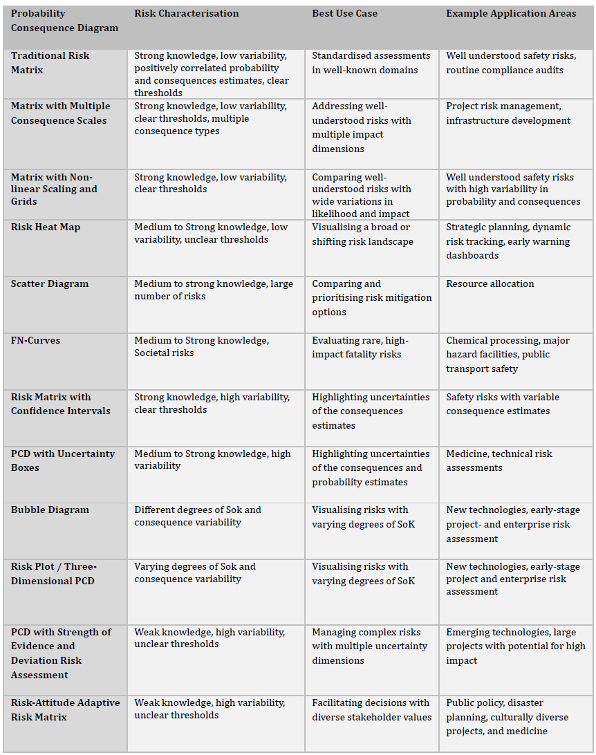
This literature study of 1,873 publications resulted in twelve distinct, generally applicable PCD adaptations. Building upon these findings, I developed two frameworks to help risk analysts select and create PCDs:
Framework 1: Selection Guide
This framework guides analysts to one of the twelve PCD adaptations based on risk characteristics and visualisation purpose. It helps match established approaches to specific risk management needs.
Table 1 PCD Selection Framework with Example Applications https://joukegaastra.com/rethinking-risk-matrices-a-scoping-review-of-probability-consequence-diagrams-and-decision-framework-for-diagram-selection/
Framework 2: Element Selection Matrix
This framework connects risk problem characteristics and intended purposes to individual diagram elements. Risk analysts can create visualisations tailored to specific needs by selecting appropriate visual components.
The table below shows Framework 2’s structure, with PCD visual elements on the X-axis and purposes/characteristics on the Y-axis:
Table 2 PCD Element Selection Matrix From https://joukegaastra.com/rethinking-risk-matrices-a-scoping-review-of-probability-consequence-diagrams-and-decision-framework-for-diagram-selection/
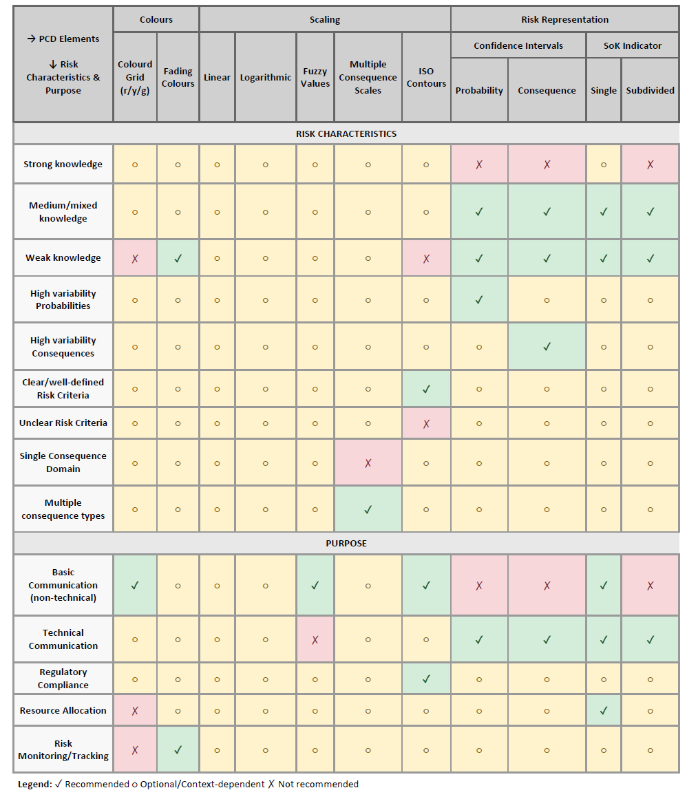
The table above shows the visual elements of the PCD on the X axes and the purpose and characteristics of the visualisations on the Y axes. The resulting PCDs can take many different forms. One particularly effective visualisation uses uncertainty bubbles and confidence intervals for consequence and probability dimensions. This approach strikes a balance between providing sufficient information for decision support and not overwhelming decision-makers.
Below is an example bubble diagram for cybersecurity risks, with exploitation effort on the Y-axis (operationalising probability) and impact on the X-axis. The knowledge dimension appears as bubble size; little knowledge (high uncertainty) creates large bubbles, whilst strong knowledge produces small bubbles.
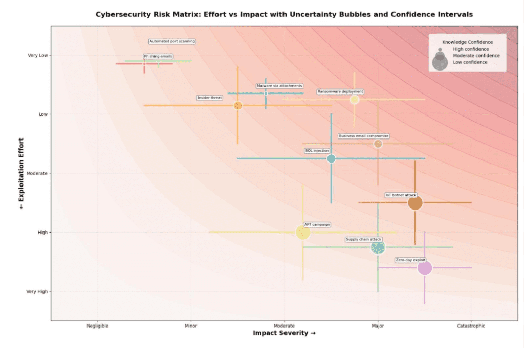
Figure 1 Cyber security risk matrix with uncertainty bubbles and confidence intervals from https://joukegaastra.com/how-to-create-a-risk-matrix-for-cyber-security/
Moving Forward with Presight
With this thesis, I hope I have taken the first step towards narrowing the gap between academic insights and practical application. I look forward to working with Presight Solutions on software solutions that can further close this gap.
The traditional risk matrix served us for decades, but as risks become more complex and our understanding of uncertainty deepens, we need visualisation tools that reflect this sophistication. Through systematic frameworks and practical software implementation, we are making advanced risk visualisation accessible to organisations worldwide ensuring risk decisions are based on the best available methods, not just the most familiar ones.